Fall Bedroom Color Combinations from Bare Home

How to stack colors on the bed
The duvet cover is what you see from the doorway. Put the mid or dark color there. Sheets peek at the fold and at the sides, so they can be a step lighter. Pillow shams can match the cover or jump to the accent.
Stay inside one family. Taupe with Sand and Cream. Grey with Light Grey and Cloud Grey. Forest Green with Sage and Cream. Mixing Red with Cypress and Cloud Grey fights itself unless one of those is a small print.
Three fall pairings we’re making this year
Antique White, Sand, and Taupe
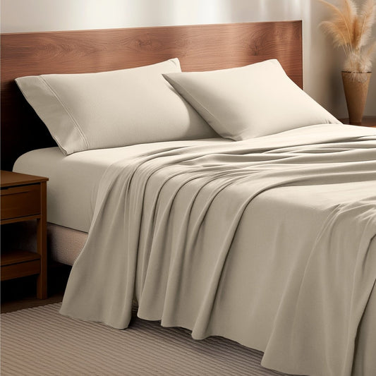
You can’t go wrong with neutrals. Cream or Antique White on the sheets. Sand or Taupe on the duvet cover. Keep shams in Taupe so the top of the bed reads as one plane.
This is the low-contrast fall bed. It works if the room already has wood, beige walls, or a lot of daylight. Shop duvet covers in Cream, Sand, or Taupe, then pull sheets from the same names in the flannel collection if you want the napped surface for cooler nights.
Light Grey, Cloud Grey, and Bering Sea

Light Grey sheets. Cloud Grey or Grey cover. One Bering Sea or Coronet Blue piece: sham pair, extra pillowcases, or a throw from blankets and throws.
Grey is the cool fall lane. Bering Sea is the deeper, greyer blue that already exists as a solid on percale sheets and other lines. Coronet Blue sits in the same family on flannel sheets and duvet covers. Bering Sea reads deeper and greyer. Coronet Blue reads cleaner and a little brighter. Use one as the cover and the other as the accent, not both at the same strength. Do not add Red on top of this stack.
Taupe sheets with Stirling Plaid
Stirling Plaid - Grey/White is the one that exists on both sheets and the flannel cover, so that is the cleanest modern swap for red/black buffalo. Chesapeake Plaid - Neutral and Checkered Plaid - Light Grey are sheet-only from what loaded.
The short version
Use catalog color names only. Cream, Antique White, Sand, Taupe, Light Grey, Cloud Grey, Grey, Bering Sea, Coronet Blue.
The cover is the field color. Sheets go one step lighter. One accent, not three.
One print per bed. Surround it with a solid that already appears in that print.
Confirm the color is on that SKU and size. Names repeat across collections. Stock does not.
Shop The Products We're Talking About


Keep Reading
How to Layer Bedding for Fall
Flannel vs Jersey vs Microplush Sheets